UX Design for activity tracking mobile app
Written by Agustina Feijóo for The UX Department. The original version was published at www.theuxdepartment.com
Dec 2015 - Jun 2016
Overview
VSP is the largest vision insurance company in the United States. In 2015 they created Project Genesis, the first wearable prototype to integrate health-tracking technology in a pair of optical frames. They chose to work with The UX Department to build and design a new mobile app that would accompany the wearable and allow users to track their health data in real time.
We collaborated in defining the key features for the app, its general behavior, and the look and feel. The goal was to create a simple experience that would allow users to seamlessly incorporate this technology into their lives.
Services provided by the agency
- User Research
- Concept Definition
- Information Architecture
- Interaction Design
- Usability Testing
- Visual Design
- UI Animation
Roles and responsibilities
We were five designers working on this project on the agency's side.
- Agustina Feijóo: I was the leader of the project, my contribution will be specified below.
- Guido Fortini: Led the visual design team.
- Belén Soria and Patricio García: Visual designers. They collaborated on the app’s look and feel under the guidance of Guido.
- A third-party contractor who crated UI animations for the app.
My role
In this project, I acted as:
- Project manager: Was the liaison between the client and our team, organizing our resources and making sure all deliverables and deadlines were met.
- UX designer: I led the discovery and research phases, gathering and digesting all the existing data, material and expectations the client had for this project; facilitated all remote moderated usability testing sessions and crafted the corresponding reports; laid out the structure of the app (information architecture and wireframes) and led the efforts to build animated prototypes for the testing sessions. Also contributed to the visual design phase.
Context and challenge
Project background and description
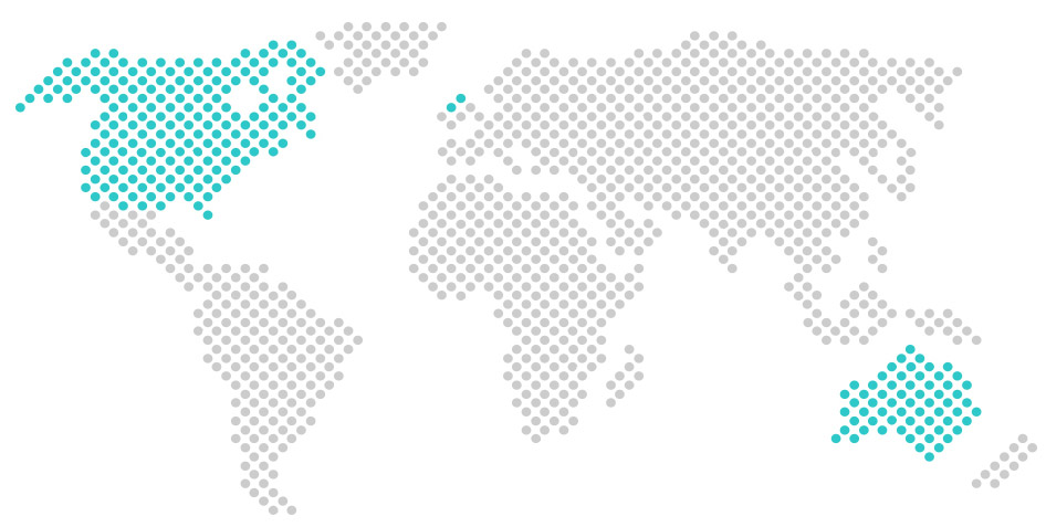
VSP Vision Care (VSP) is a vision care health insurance company operating in Australia, Canada, Ireland, the US, and the UK. It serves about 80 million people worldwide and is the largest vision insurance company in the United States.
We worked over the course of six months together with The Shop, VSP’s innovation lab that focuses on developing technologies for the physical and digital aspects of eyewear and eye care, to build a mobile application for both Android and iOS.
The problem
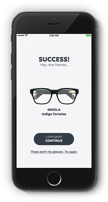
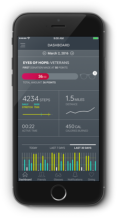
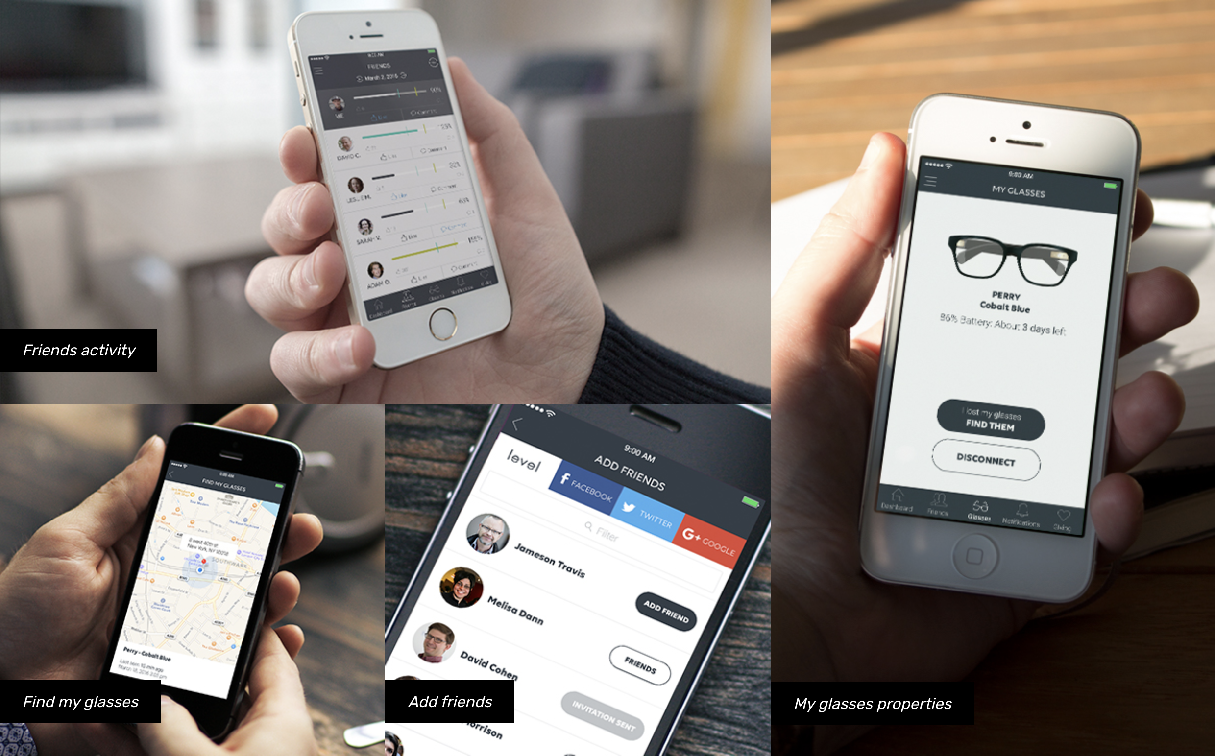
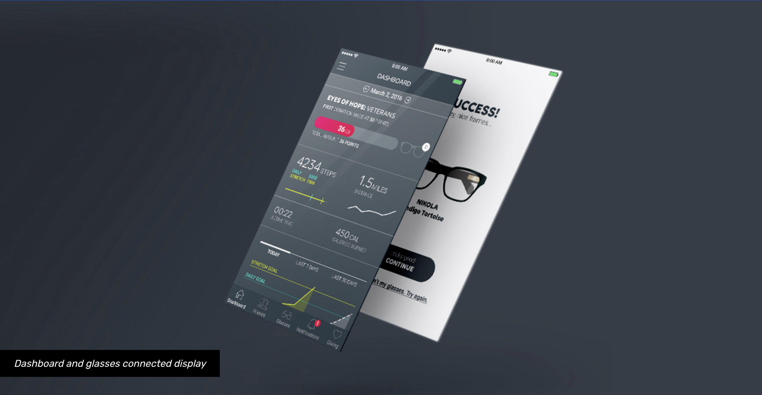
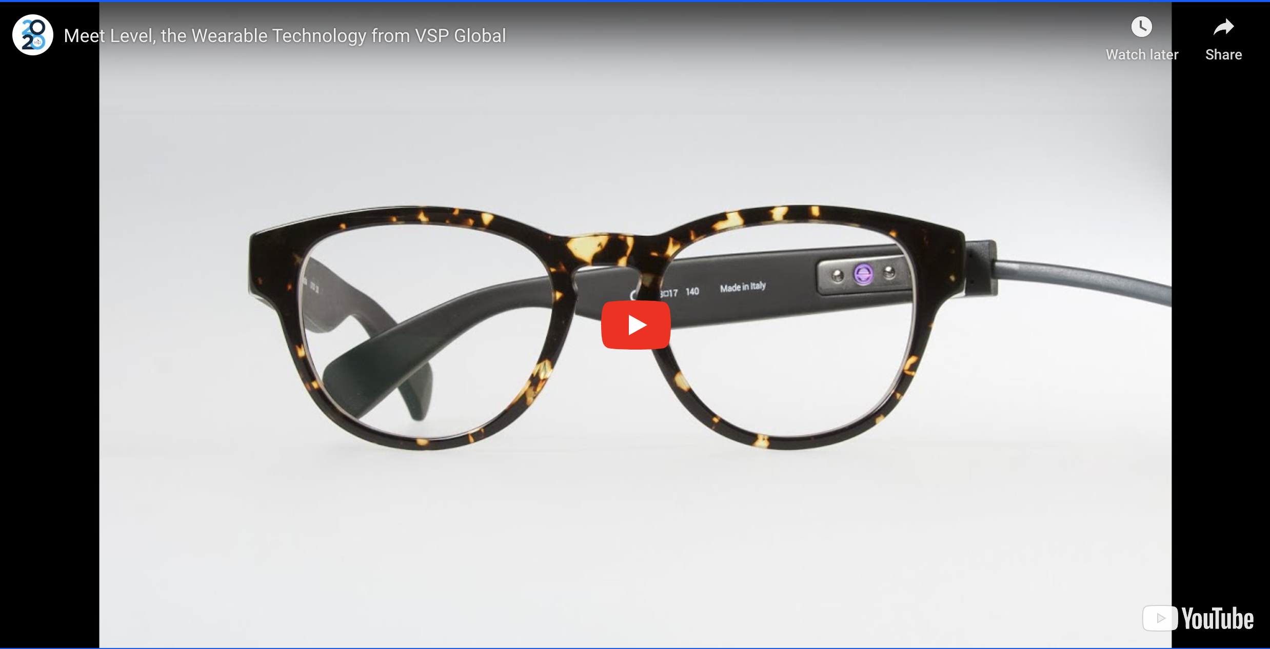
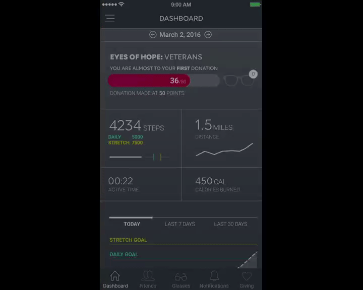
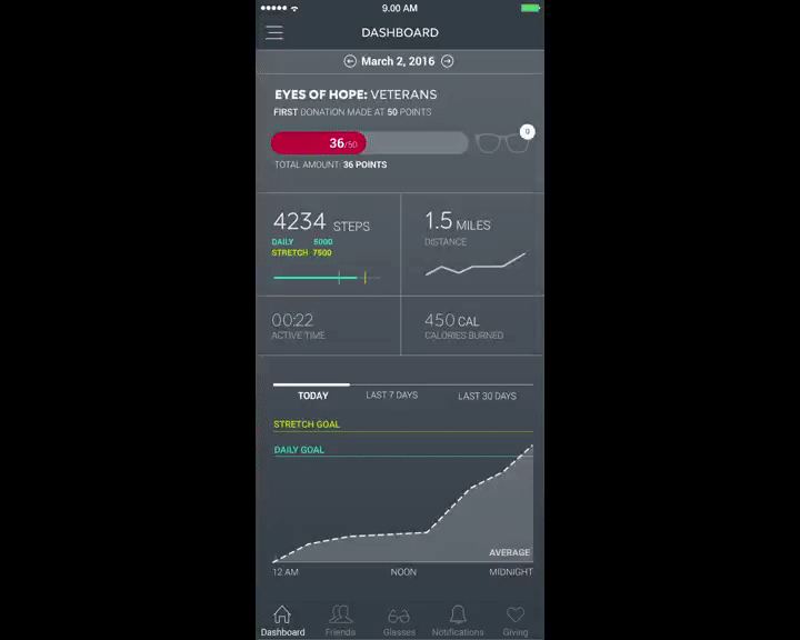
The Shop had created Project Genesis, the first wearable prototype from a healthcare company to integrate health-tracking technology in a pair of optical frames. The prototype could accurately tracks steps, calories burned, and distance traveled.
The Shop’s goal with this project was to provide the wearer with contextualized health data about themselves.
This technology required an accompanying app that users could deploy to track their health data in real time.
The application also needed to include an extra layer of social engagement through giving. When the wearer’s fitness goals were reached, a pair of glasses and a comprehensive eye exam would be donated by VSP on the user’s behalf to someone in need in the US.
Project goals and objectives
Our objective as a UX design studio was to integrate this set of features in a way that was simple and clear, in a layout that would be appealing to the user.
The measurement of success would be the collection of direct feedback. For the initial launch, the application would be made available to a select group of 200-400 influencers in the fashion and technology fields for use and evaluation over a 120 day period, in a study that would later be conducted by the University of Southern California's Center for Body Computing. The objective would be to obtain direct feedback from this group of users to learn how they relate with the app.
Hypotheses
- Consumers will use the product longer than other activity trackers because the activity tracker is seamlessly integrated into eyewear that is fashionable and attractive, comfortable to wear, not easily lost, and durable.
- “The principle of ‘helping others by helping yourself,’ implemented as a charitable giving experience, fosters habit formation, social motivation, and goal reinforcement, which results in long-term and frequent product engagement.”
Discovery Metrics
As secondary measures of success, the number of times users opened the app and the amount of time they spent within the app would be evaluated in a future study conducted by the University of Southern California's Center for Body Computing.
Users and audience
The app was originally targeted towards women and men between the ages of 23 and 45 that possess the ‘millennial spirit,’ enjoy being fashion-forward, and value quality and workmanship, unique experiences, and the ability to connect and share with others.
Process
Discovery phase
During an initial discovery phase, I gathered information that would be used to establish the app’s audience, context, and objectives. I received documentation from the the client that described their target audience and their expectations for the product in terms of behavior and look and feel.
From the requirements I created:
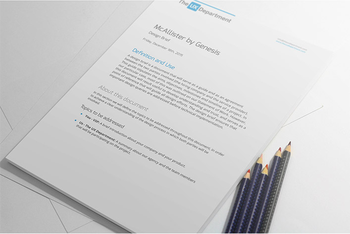
A design brief
A design brief is a document that serves as a guide as well as an agreement between the two parties involved (the hiring company and the service provider). This guide stipulates the aims, objectives, milestones, and timeline of a project. It is a useful tool that guides all design efforts.
A positioning statement
A positioning statement is a concise description of the target market and a company’s substantiable, verifiable point of differentiation among its competitors. Its core purpose is to help maintain focus on the brand’s value proposition.
Interaction design phase
The application map, user flow, wireframes and other relevant project documents previously created by The Shop at VSP Global on their first attempt to design the app were reviewed and discussed by The UX Department and The Shop to determine the key components of the application.
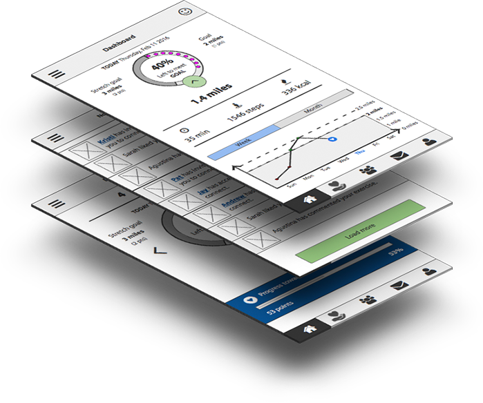
Having an initial understanding of the needs/wants of the target users, and the requirements of the client, I drafted a few versions of wireframes that were presented to the client, discussed and adjusted accordingly. Then my team and I collaboratively created an interactive prototype and I facilitated the first round of moderated usability testing sessions. Feedback from these sessions was incorporated into the application map and wireframes.
At the end of this process we delivered the Information Taxonomy document (application map) and the wireframes for all the key pages of the site.
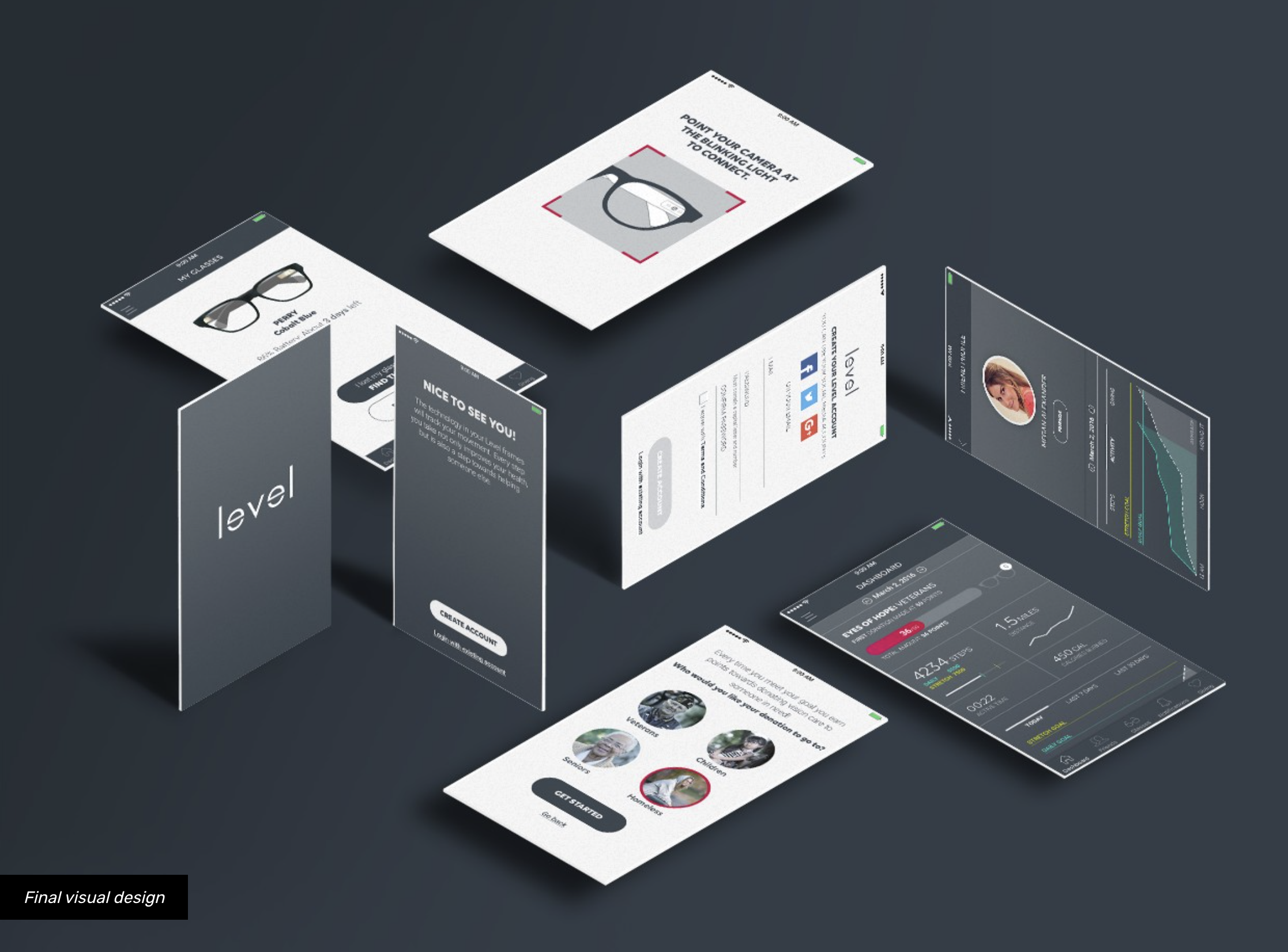
Visual design phase
The Shop provided samples of digital experiences with explanations of desired and undesired behaviors, as well as comments and preferences on the look and feel for the app.
From these insights, the visual design team built an idea board, which included different aesthetic options covering color palettes, type families, animations/interactions, and imagery styles that would possibly appeal to our target audience.
We used this idea board as a conversation trigger in order to get feedback that allowed us to produce a second board: the mood board. The mood board presented specific choices for the color palette, type families, etc. and served as the guide for the visual design of the application.
Once the basic design elements were defined, the visual design team created a series of options to present to the client.
A new challenge
After the first design options were created, VSP had to change the product’s brand and its target audience: we were no longer aiming towards young millennials, but older adults with a steady income. At this point we had to double our efforts to create a new design based on the updated requirements while keeping up with the project’s timeline and VSP’s expectations.
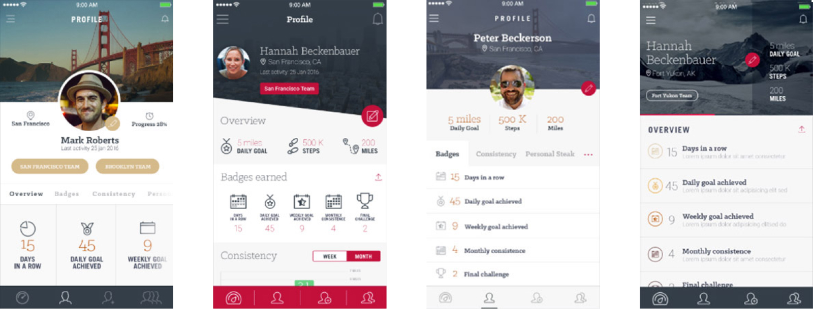
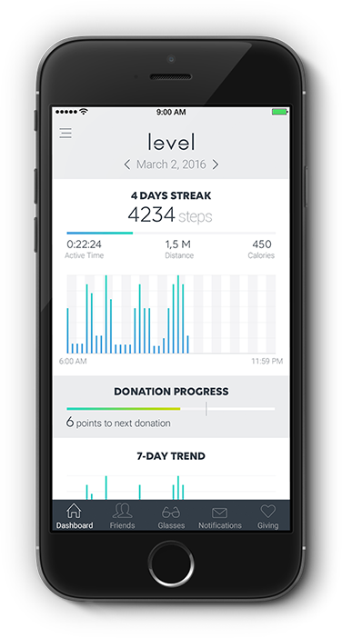
When the new style was settled, we created mockups for each section of the app, and we also engaged a third-party contractor to create animations to illustrate the app’s behavior and interactions and to guide the development efforts.
We delivered high-fidelity mockups for each of the mobile application’s screens (iOS and Android) and the assets ready for implementation at every screen resolution.
Usability testing
At various times during the project, we conducted moderated usability testing sessions to put our assumptions regarding the functionality and design of the app to the test.
I estimated and planned the entire process and I moderated three rounds of remote usability testing sessions (a total of 30 sessions). I also participated remotely in the in-person testing round that was conducted in San Francisco and assisted the on-site moderator with note-taking.
The on-site session was used to validate the wireframes I created. After the resulting insights were incorporated into the design, we subdivided the app into sections and worked on these sections on two-week sprints. After each section was completed, I conducted a round of remote moderated usability testing. Each round of testing was done with ten participants. All incoming insights were incorporated into the design before moving forward onto the next section.
During the project, we conducted a total of 40 moderated usability testing sessions.
Results
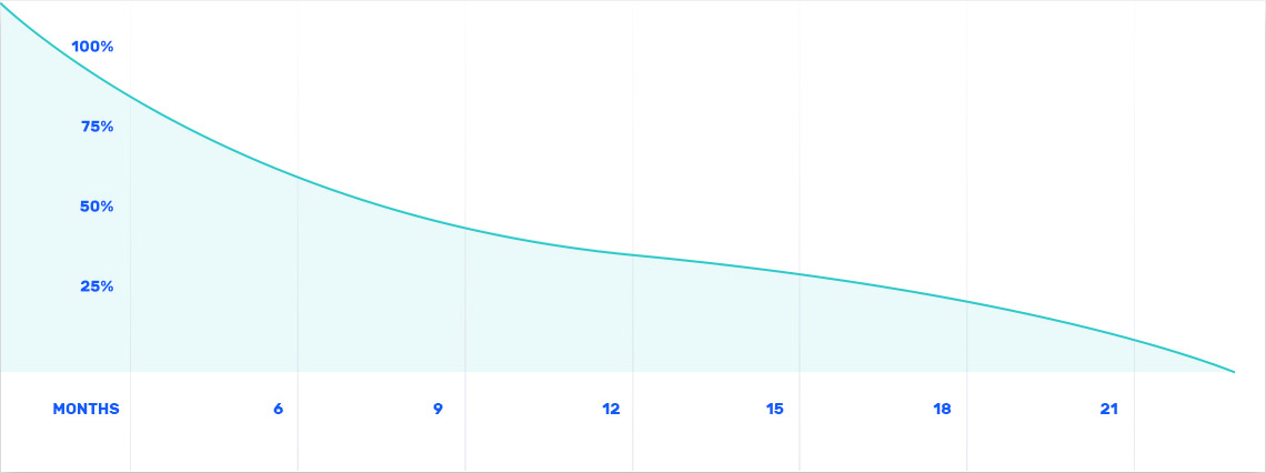
According to a pilot test done by the University of Southern California's Center for Body Computing, the original hypothesis turned out to be mostly true. Of the 284 employees that signed up for the Level trial, 221 ended up sticking with the platform for the full 15-week duration of the study (nine people never participated at all, while 54 dropped out mid-way through). According to the research, subjects much preferred having the activity tracker embedded in their prescriptive eyewear, rather than having to put on a separate wearable. Other factors proved helpful as well, like motivational prompts and encouragement from friends within the app.
Source of this excerpt
Complete results from the study were published at NEJM Catalyst
Testimonials
“Working with The UX Department was like working with an extension of my own team. Agustina, the lead UX Designer for the Level project, went out of her way to make sure we were always on the same page. The team seamlessly managed large changes midway through the project and worked around a multitude of potential roadblocks. The UX Department played a major role in the success of our pilot test.”
"I had the pleasure of being Agustina's client partner while designing an app for a new category of products - activity tracking smart glasses. She was a great resource for helping the team find a direction that was both user-friendly and functional. She was always willing to go out of her way to meet the team's expectations, while pushing back when necessary,and was very agile when unexpected directional changes occurred. Her testing methods were thorough and gave us confidence that we were shipping a product that people would love. Anyone would be lucky to have Agustina on their team."
KRISTI GAUDIO – DESIGN & INNOVATION – THE SHOP @ VSP GLOBAL
Awards
Indigo Awards
- Gold in Innovative Use of Mobile Technology 2018
- Gold in Mobile Interaction & Experience 2018
- Gold in UX, Interface & Navigation 2018
- Silver in Apps 2018