Haiku Crow - Product design for strategic pricing web app and marketing website
Written by Agustina Feijóo.
Mar 2020 - Aug 2020
Overview
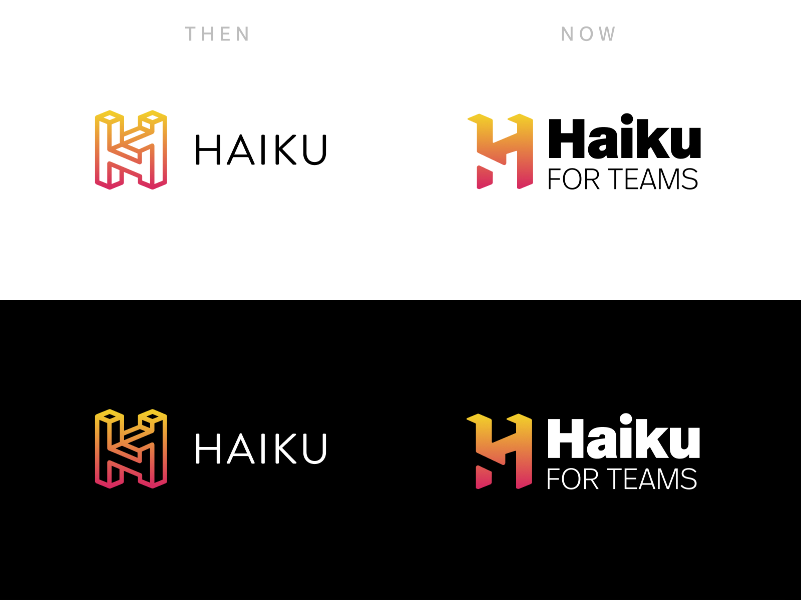
Haiku Crow (now rebranded as Haiku Optimizer) was the last product I worked on during my time at Haiku.
Haiku for Teams seeks to help teams improve their collaborative processes through innovative tools. In the case of Crow, it's aimed towards marketing and sales teams on subscription companies, and it allows them to experiment and iterate on their pricing strategies without writing code.
Company website
Crow (Optimizer) website
Problem statement
At the beginning of 2020, the company's Founder and CEO decided to start building a new product that would be intrinsically connected to the business aspect of SaaS companies. He envisioned that this new product would help marketing and sales executives grow their businesses and increase revenue by exploiting untapped markets and getting better and more detailed reports containing a comprehensive breakdown of their data.
The initial idea for the MVP was to start by offering pricing localization features. This would allow SaaS companies to increase acquisition and extract more revenue by offering potential customers from other parts of the world, who would otherwise have found it difficult to afford their products/services, a tailored pricing structure in line with their purchasing power parity (PPP). In other words, we worked from the hypothesis that Haiku Crow would allow companies to avoid leaving money on the table.
Users and audience
This product would be designed with the needs and wants of three types of users in mind:
- Sales/Marketing exec: High-level representative of the company with purchasing power looking for new ways to extract revenue and help the company grow. Our goal was to give them the power and freedom to experiment with pricing without needing to constantly hand-off to a developer for implementation.
- Developer: Technical team-member typically tasked with implementing any changes to pricing structures, reflecting them in databases and marketing websites. Our goal was to simplify the processes related to pricing implementation so that they could focus on other aspects of their work.
- Potential customer: Shop owner or business person from a foreign country, looking to improve the performance of their own business through the usage of tools/services appropriately priced for their income that they can afford. Our goal was to automatically display the appropriate pricing and currency to streamline the purchasing process.
Scope and constraints
We were a small and distributed team working across time zones on a tight deadline building a new technology that seemed to be unique at the time.
My role
I was the only designer working on this product, collaborating directly with the company's founder and CEO. I:
- Planned and conducted preliminary research to validate the product idea.
- Defined the visual styles our product would have, including type family, color palette, and UI components.
- Collaborated with the CEO, understanding his vision for the product and translating that vision into an information taxonomy map, wireframes, mockups, and a component library.
- Helped the development team polish the implementation by shipping code myself.
- Designed and implemented the first two versions of the marketing website.
Process
Prior to the implementation process, we invested a couple of weeks in research to validate or invalidate the product idea
Originally, there were other product ideas competing with Crow. To settle on one, we needed to make some basic definitions regarding each option and later go through a validation process:
- Who was our customer (audience)?
- What problem were we solving?
- How would the product solve those problems?
- What was the value prop?
- What would be the key features?
- What was the business model? Price?
- How large should the market be?
All the definitions made at this point were assumptions that we needed to validate. To do that, I put together a framework (after consulting multiple sources) through which we could filter the ideas and see which one made it to the end of the race.
The framework consisted of four validation phases. Each of these phases offered multiple tactical options varying in complexity and cost. I went through this framework with the company CEO and we settled on a strategy that was feasible given our resources and time-frame. These phases were, in short:
- Validate the problem: Find people who can relate to the problem statement of a given idea, through simple outreach to existing contacts, interviews with representative users, or contextual inquiry/ethnographic study.
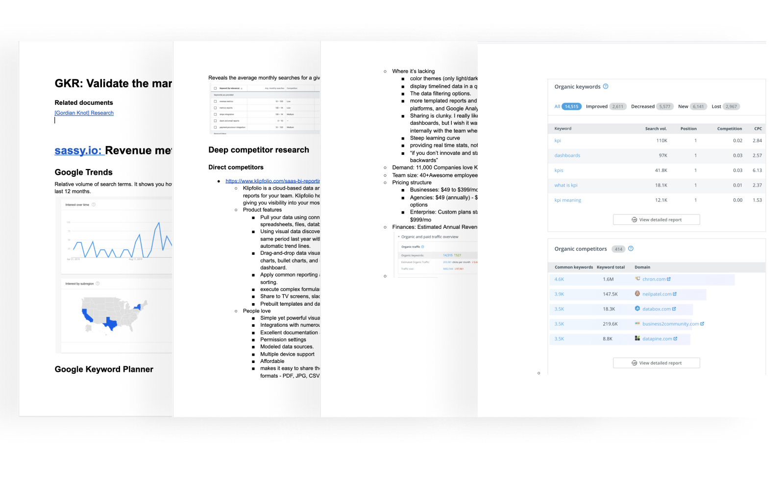
- Validate the market: Analyze growing topics, keyword traffic, perform deep competitor research (direct and indirect), run content audits and traffic analysis on competitor websites, dig through social media and forum comments, conduct VC intelligence, check statistics and industry reports (if any), etc.
- Validate willingness to pay: Through tactics such as fake-doors experiment, validation website touching base on its selling points, concierge MVP, pre-sale launch, crowdfunding campaign, or try a service like QuickMVP.
- Validate the product: Prototype and test through methodologies such as Wizard of OZ prototyping, guerrilla usability testing, remote moderated usability testing or in-person usability testing.
After the first couple of validation phases, the company decided to move forward with Crow.
Regarding my participation in this process:
- I closely collaborated on the first phase with the company's CEO. We decided to go through with the option that required less effort (outreach to existing contacts).
- I undertook the second phase on my own and presented an in-depth report with the gathered data to the CEO.
- Once the idea for Crow was selected, we undertook the minimal implementation work necessary for a concierge MVP. I worked on both the UX and UI of the project, working closely with the CEO to try and stay true to his vision.
- The fourth phase was pending at the time of my departure from the company.
With the product idea defined, I started building the visual language for Crow
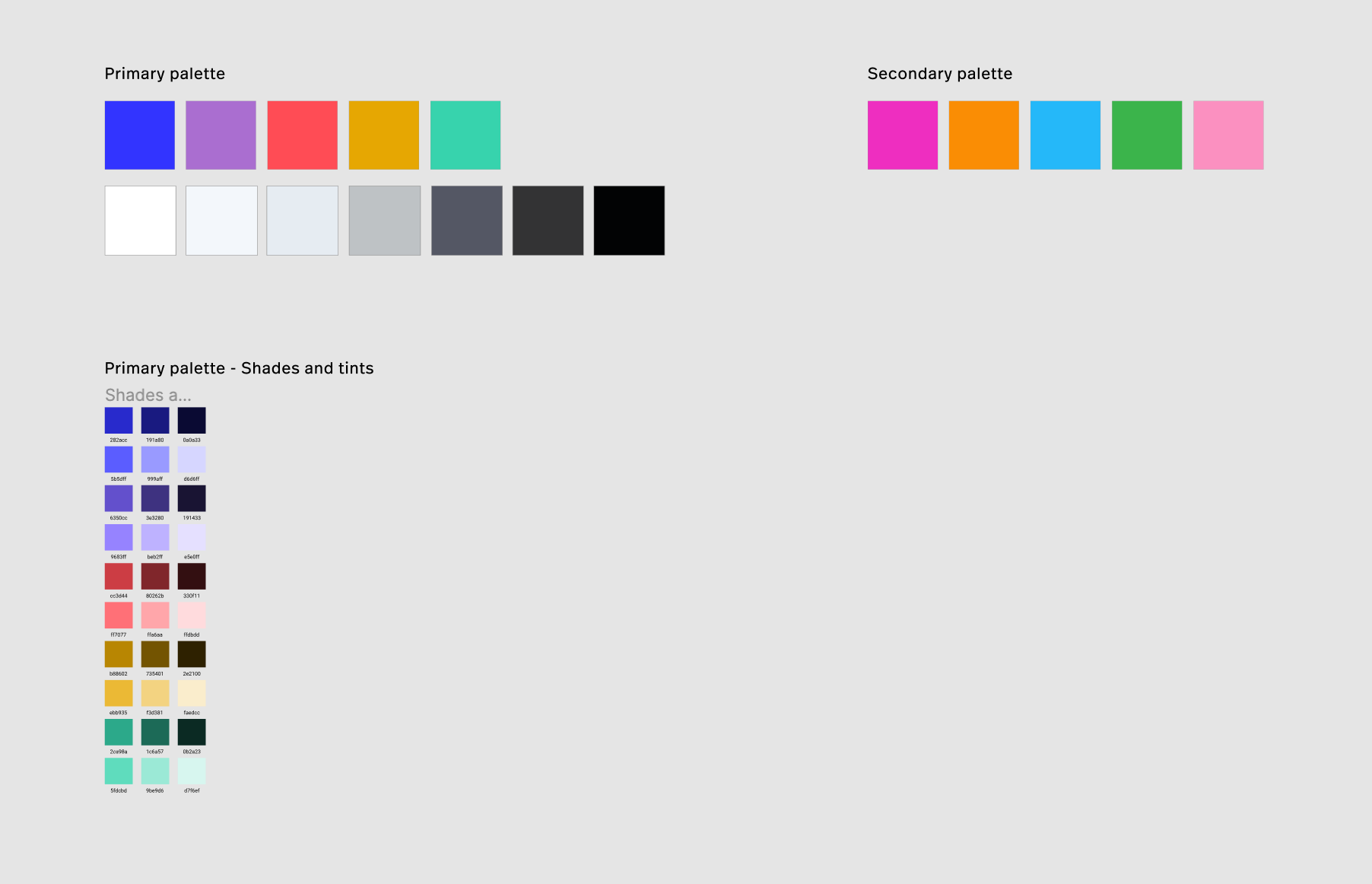
I started by putting together a series of color palette options, varying in complexity (from a couple of complementary colors to square or pentagon color combinations).
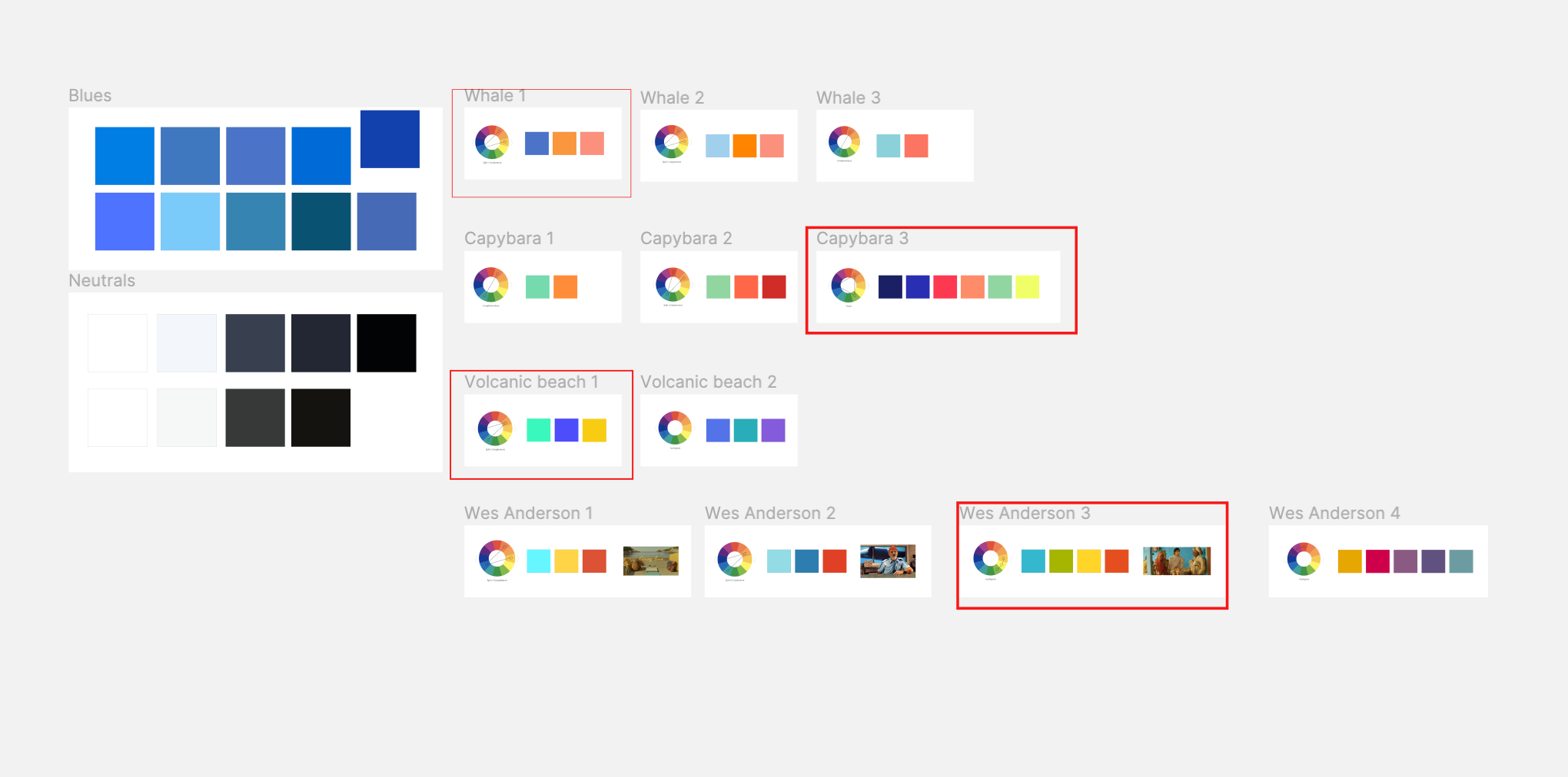
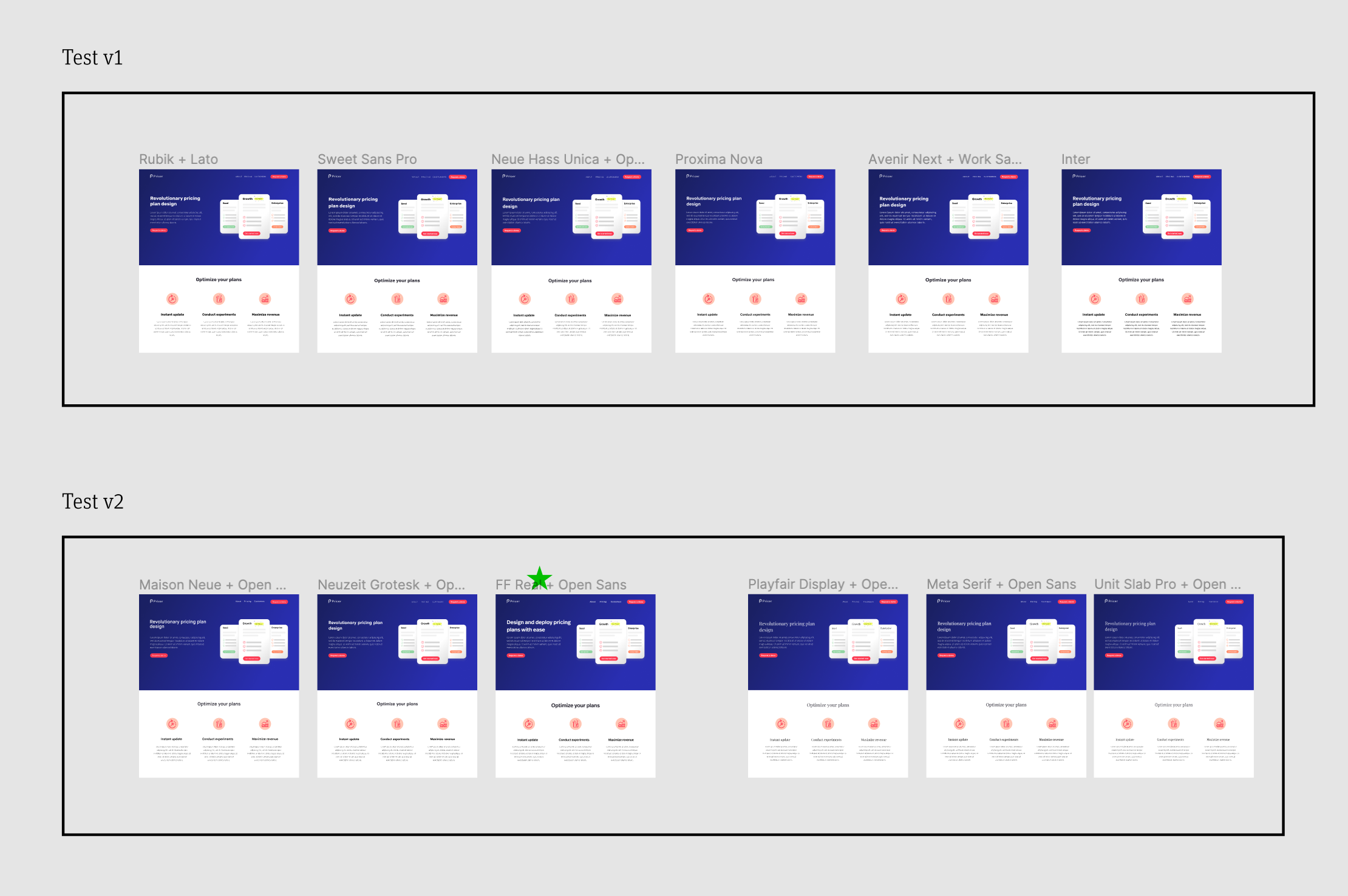
After a couple of options were discussed with the CEO and selected, y created some basic placeholder website mockups to show how the colors interacted with one another, which allowed us to observe the strengths and shortcomings of the different options. Through this process, we ended up selecting what would be the final palette for Haiku Crow.
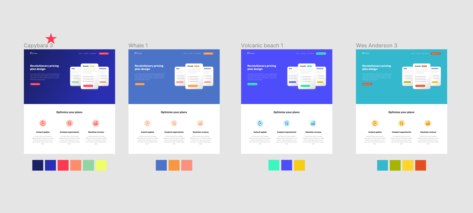
We selected this palette due to its versatility (which would be useful on the myriad of graphs, illustrations and other infographics we knew were going to be needed) as well as its personality (serious enough but never boring) and good contrast.
I conducted a similar process for the selection of a type family. I used the same placeholder mockups to display an array of options ranging from modern sans serifs, to elegant serifs and a spectrum of font pairings in between. We decided to go with FF Real by Erik Spiekermann. This type family would also be used on the brand redesigns we had planned for the other company/product logos, and on the new versions of our marketing websites.
Finally, I defined the typographic hierarchies and started building some basic UI components and design tokens like buttons, links, cards, shadows, spacing, and so on. I created a style library in Figma, which we would later consume to create our marketing website and the product itself.
With the visual language in place, I moved forward with the creation of the first two versions of the website, with varying degrees of clarity around functionality and messaging
At first, we had a general understanding of the idea behind Crow, but there was still a lot of uncertainty regarding specific features and behavior. So, in the first iteration of the marketing website, we focused more on the idea or strategy and less on the specifics and tactics.
The CEO put together a content outline for the first version of the website, and from that, I created some rough sketches on my iPad, and once approved I applied the visual styles we had defined so far, plus other stylistic details, that continued to morph over time.
After a little time, we had more data, more clarity in the vision, and more definitions around functionality. At this time, we were ready to embark on phase three of the validation process (validate willingness to pay via a concierge MVP) and start offering the product and all it could do (which, in a concierge MVP, a lot of it is mostly done by hand behind the stage to avoid creating a robust implementation ahead of the validation process). The CEO produced a new content outline and I drafted, created mockups, and implemented this second iteration of the marketing website using Webflow for speed (the website was ready to be deployed in under two days, responsive and all).
Product design
Laying down the groundwork for the product design through information architecture and wireframing
This process started with one-on-one meetings between the founder and myself during which we discussed his vision for the product, we explored some user flows, discussed the main screens necessary for the MVP, and observed patterns and strategies from other related and non-related products. During this exchange, we both created low-res drafts for the key screens of the app and discussed their pros and cons.
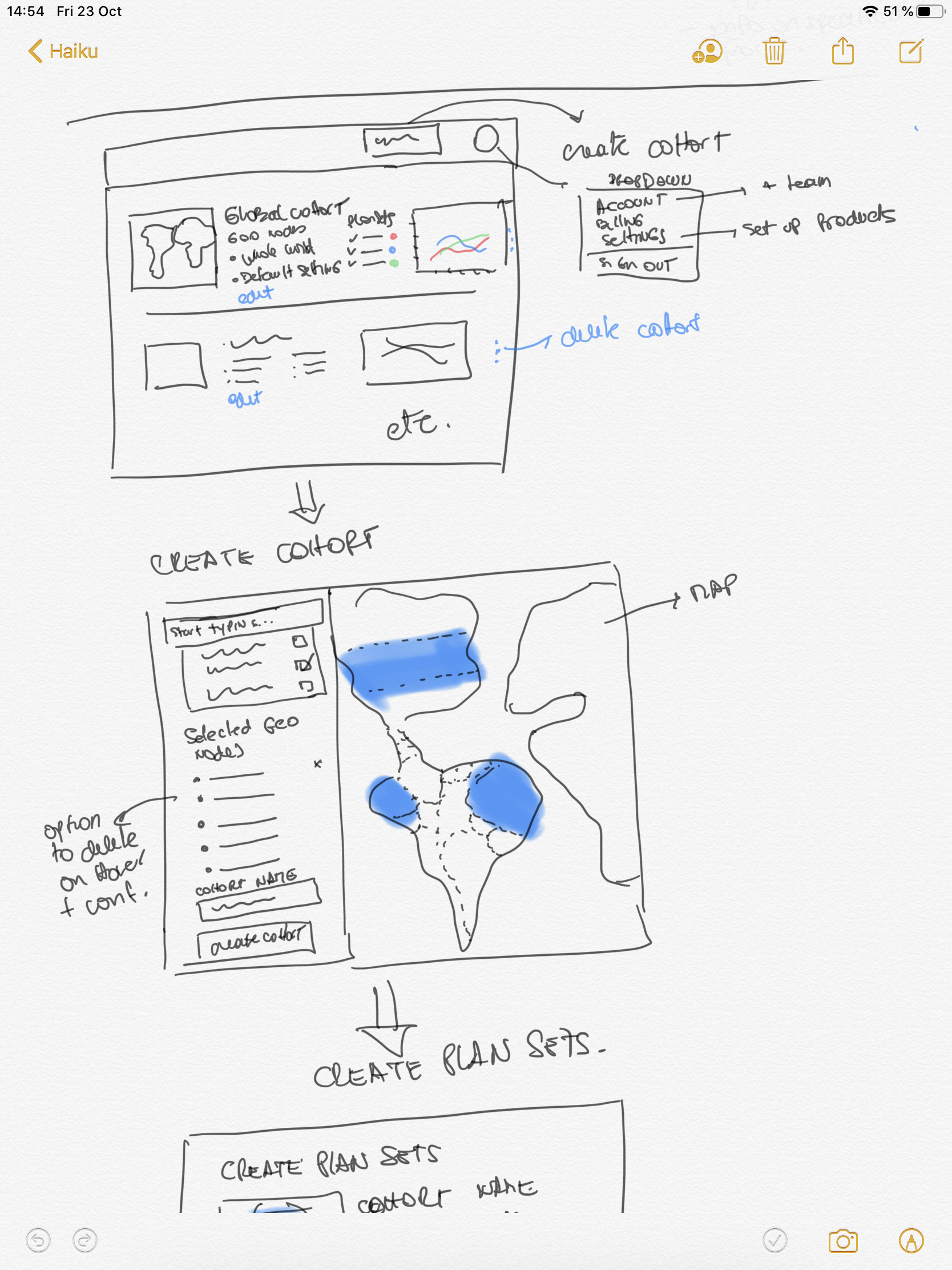
After we achieved a certain level of understanding regarding the core of the idea and the necessary behaviors we needed to design for, I created an information taxonomy map with numerated screens and sections to be later matched with the corresponding wireframes and mockups, to serve as a road-map for the upcoming design phases.
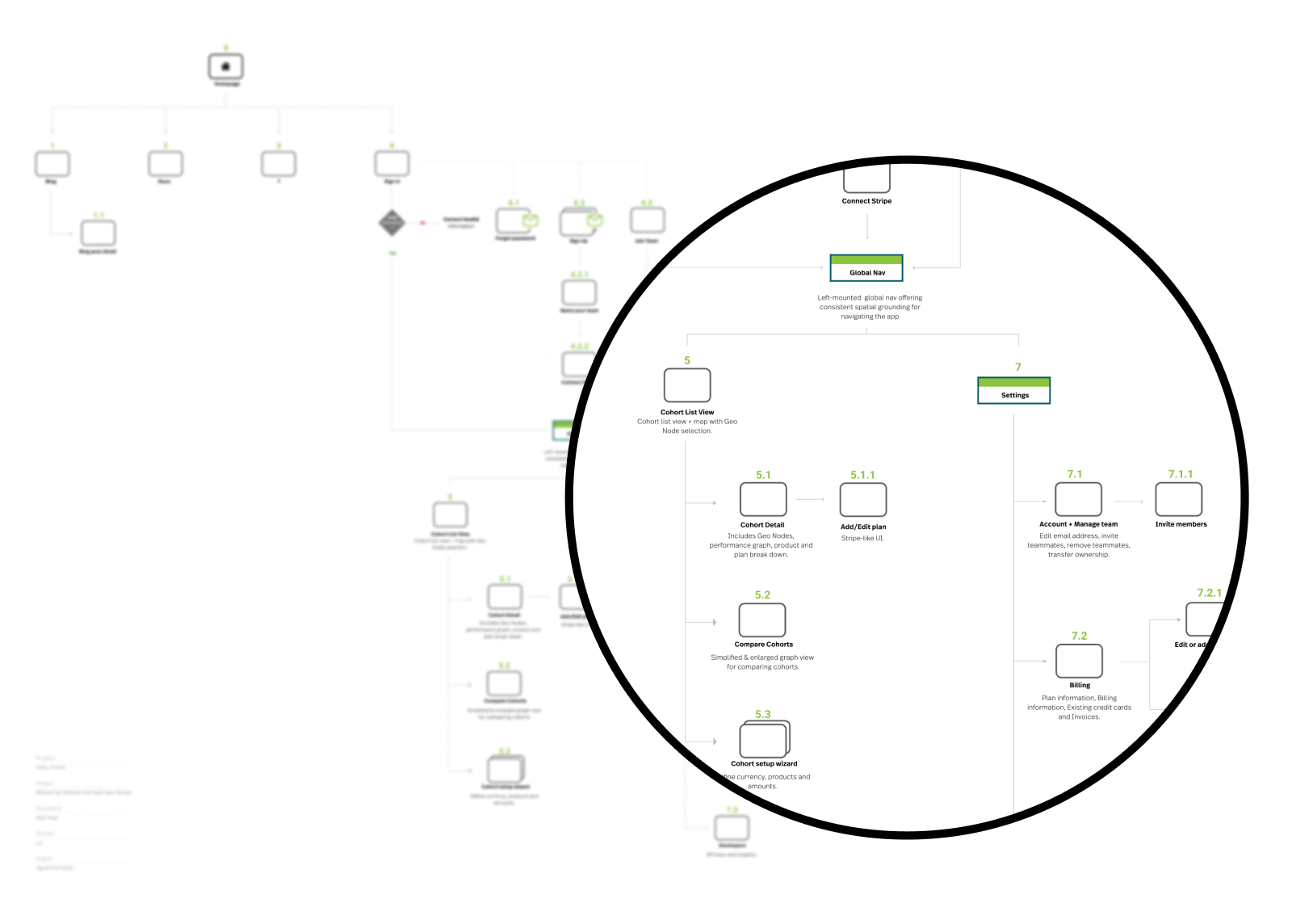
Having laid out the basic structure of screens, sections, and how they connect, we started focusing on the behavior and patterns of each screen. These are some of the user stories we needed to cover in the design:
- As a sales/marketing exec, I need to connect Crow with my company's payment gateway so that we can access our products and plans and iterate on the pricing strategy.
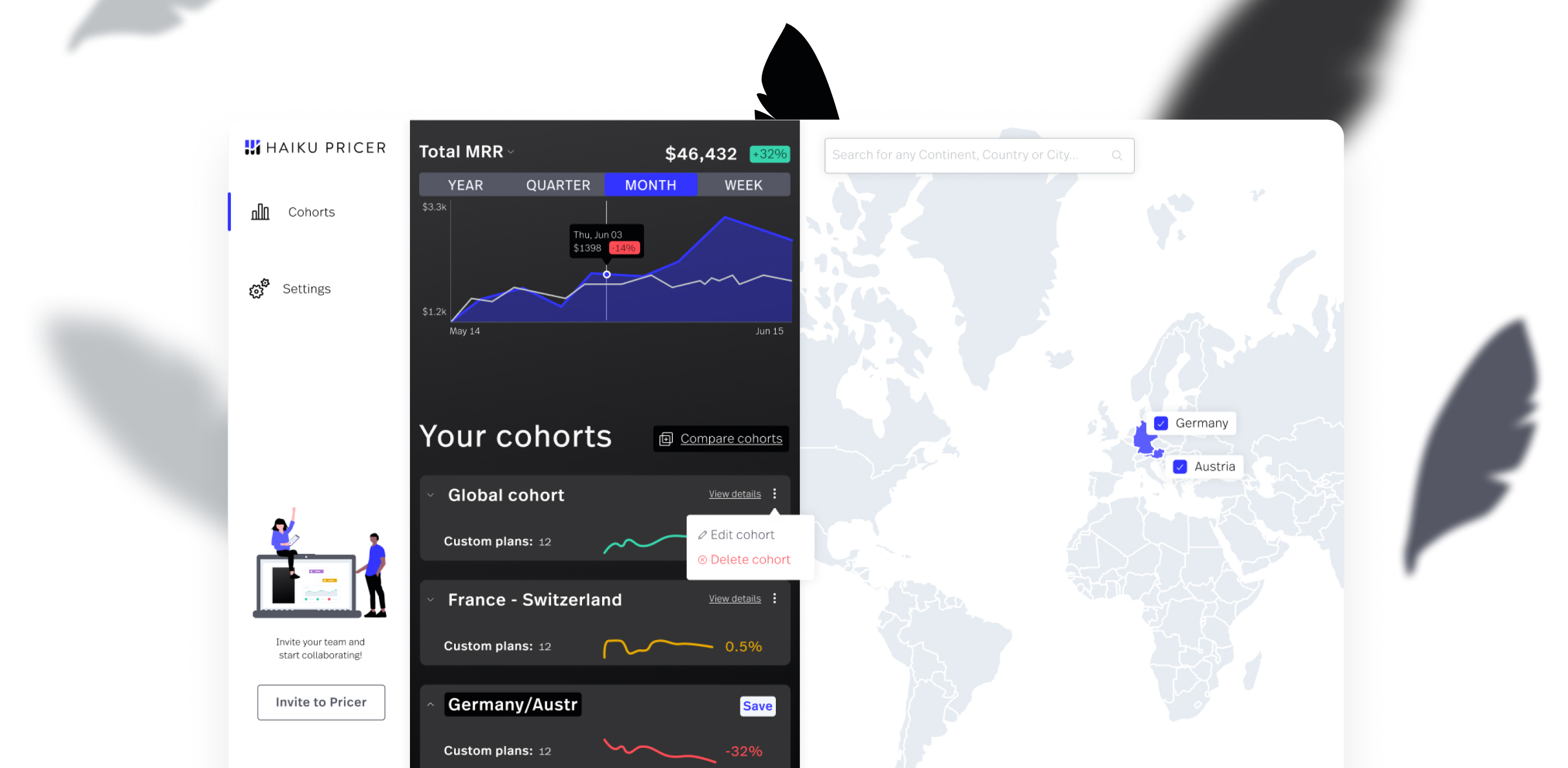
- As a sales/marketing exec, I need to select and group different countries to create a cohort so that I can target customers living in those areas.
- As a sales/marketing exec, I need to assign a specific price and currency to each cohort, so that the customers in said cohorts can access my product/service at a PPP-based price and pay in their currency.
- As a sales/marketing exec, I need to create, read, update and delete (CRUD) my cohorts so that I experiment as necessary.
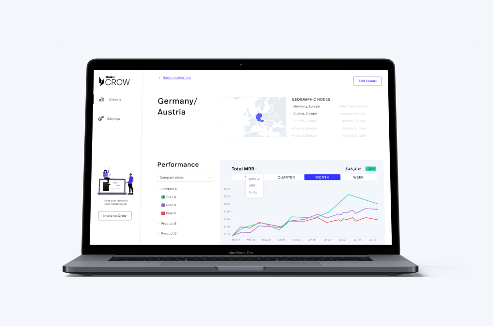
- As a sales/marketing exec, I need to see how my cohorts are performing in terms of revenue so that I can adjust my pricing strategy accordingly.
- As a developer, I need to access the API key tokens and snippets from Crow so that I can do a one-time connection with the company's payment gateway.
- As a customer, I need to see targeted prices for the product/service I want to purchase in my currency so that I can make sure I can afford it.
Note: at this stage, I planned and created the baseline structure of the app, not only for the concierge MVP but also for V1.
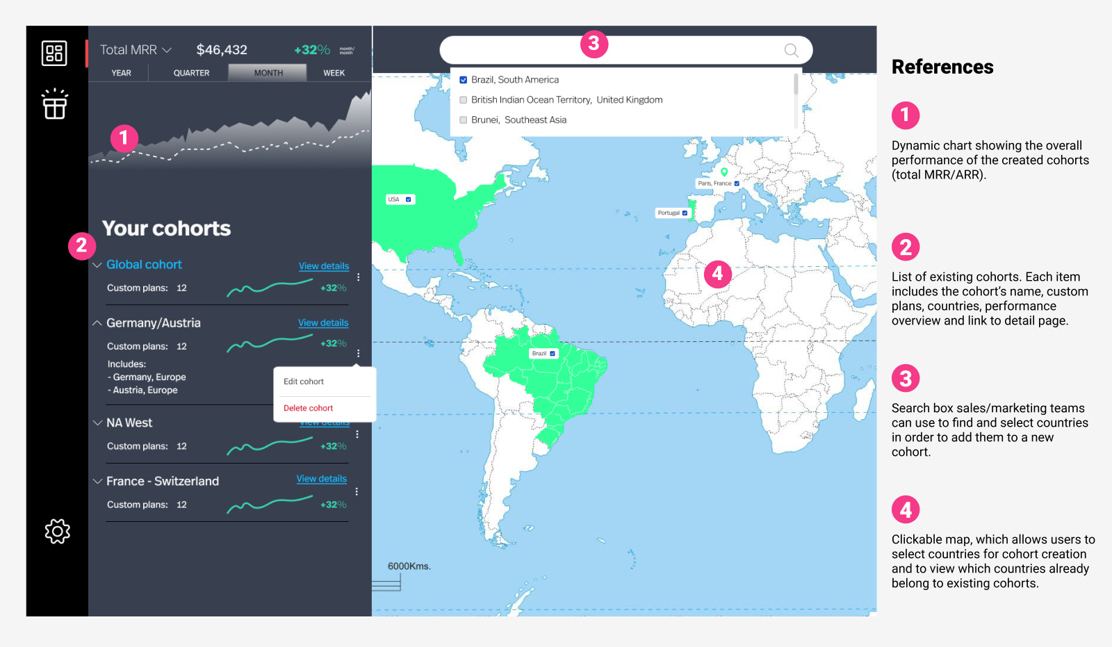
With the structure and the style library in place, I proceeded to put together the high-fidelity mockups for the product
Along the way, new feature ideas came up. Each one was discussed, drafted, added to the application map with its corresponding nomenclature, and mocked up.
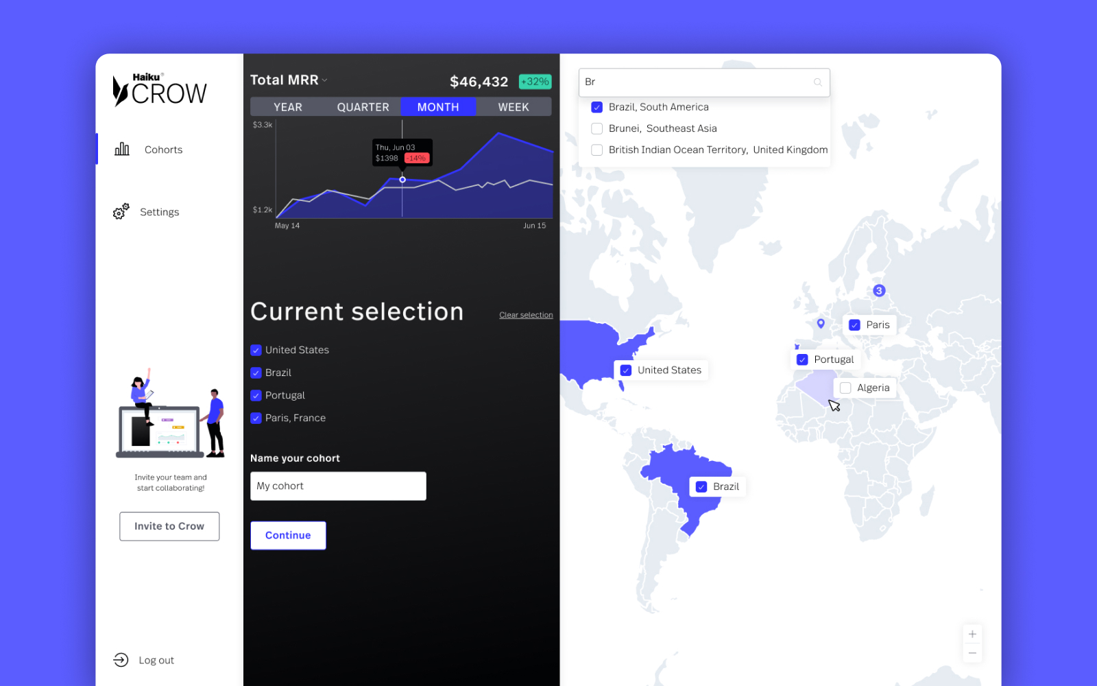
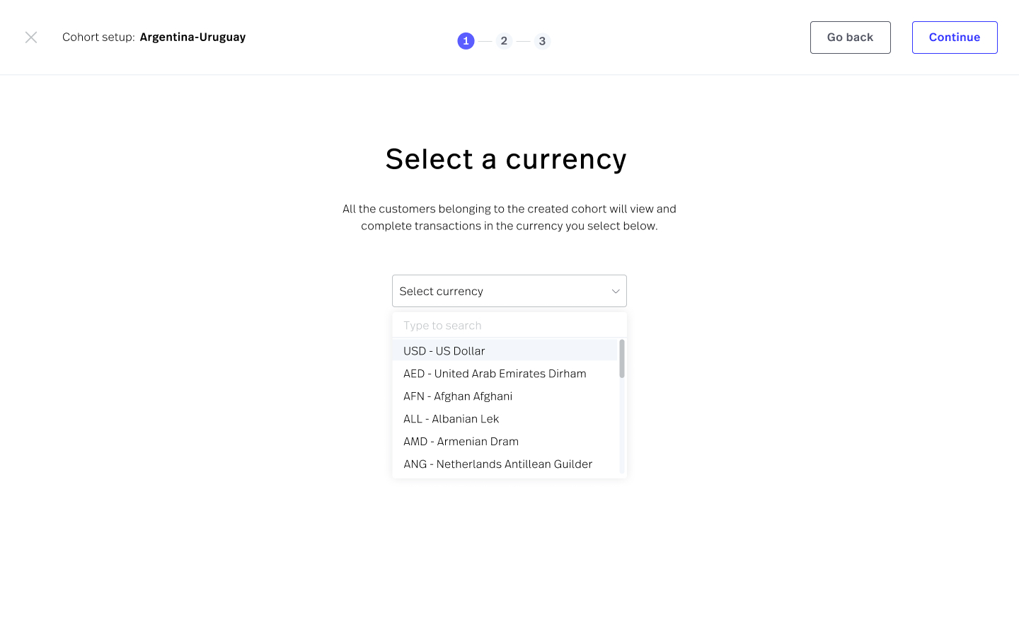
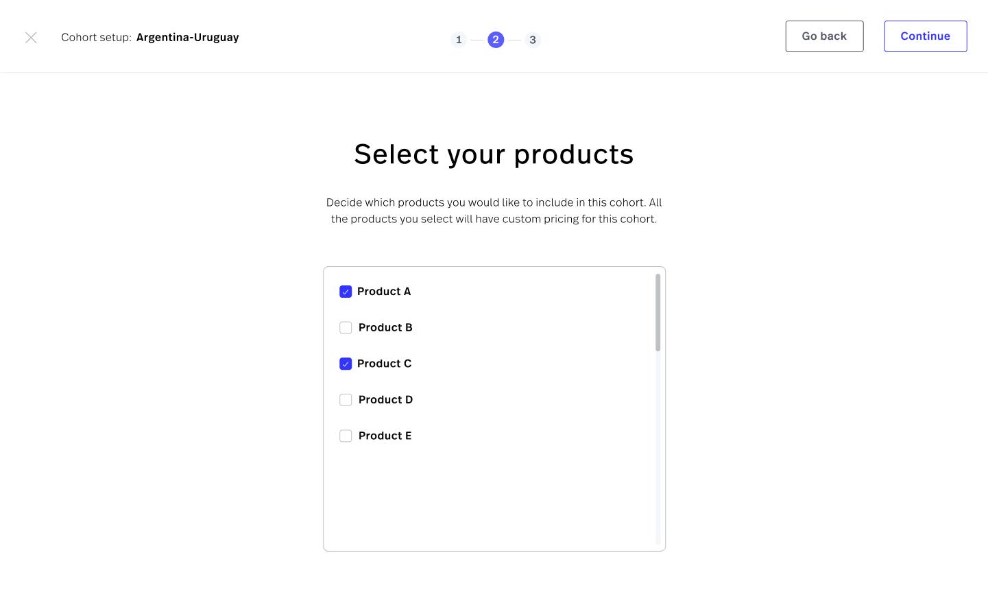
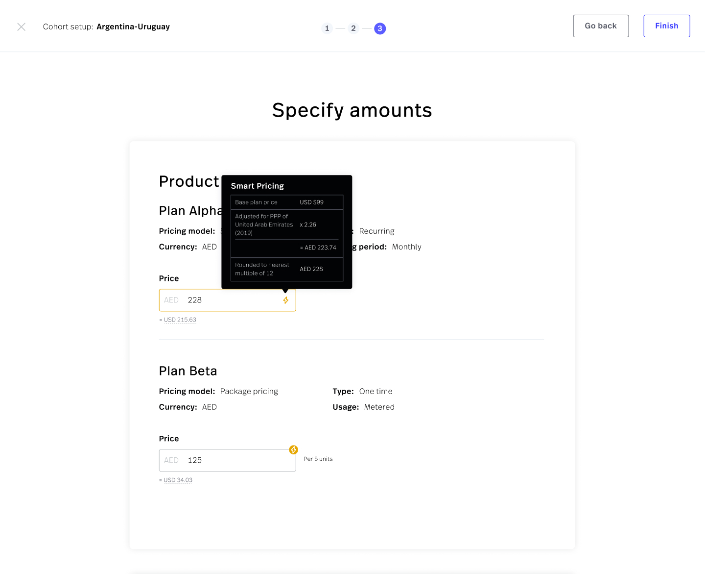
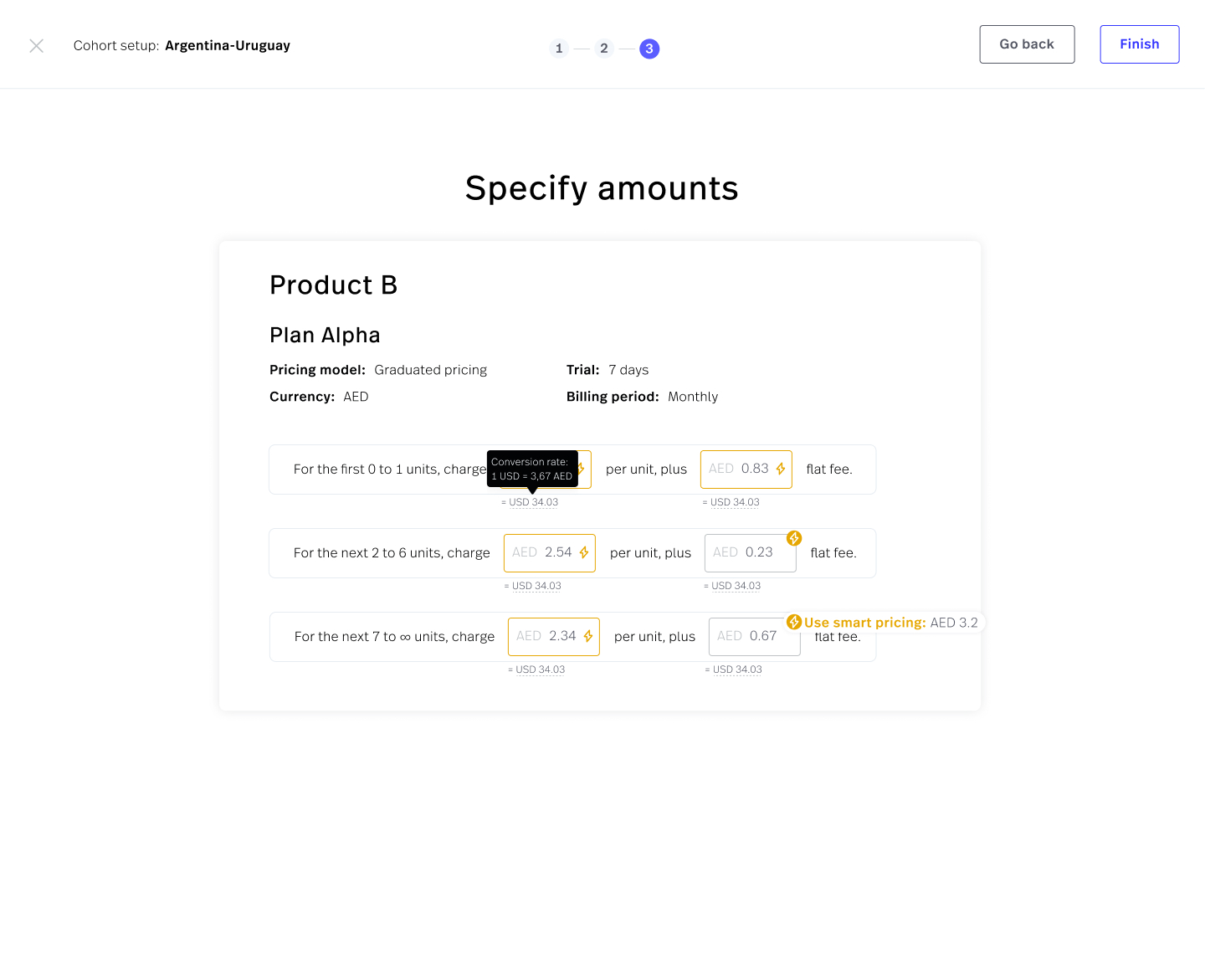
One of those added flows was the cohort creation wizard, including the smart pricing feature.
This new flow gave the primary user (sales/marketing exec) more control over the cohort creation process, going from just picking countries and naming the cohort, to additionally:
- Defining a specific currency for this cohort
- Selecting the products that will be included or affected by this cohort
- Modifying the pricing structure for each product and plan
At the same time, this could be done much more easily thanks to the in-depth automatic recommendations in smart pricing, which took into consideration data points such as the base plan pricing, the selected area's PPP, and annual/monthly rounding to get whole numbers.
Aiding with implementation
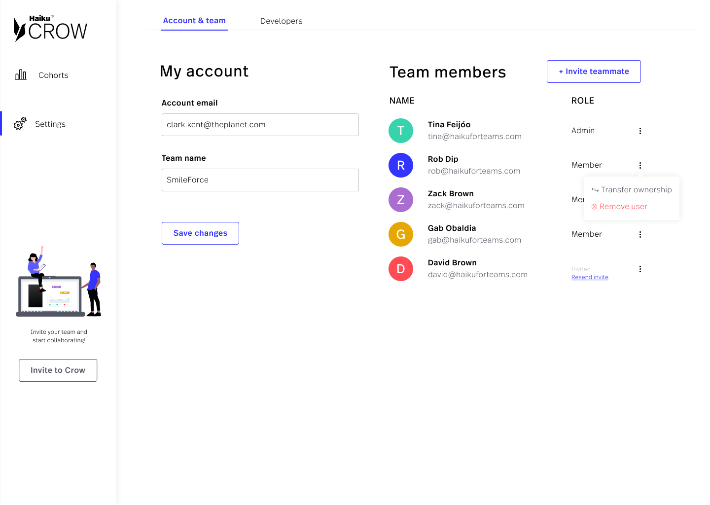
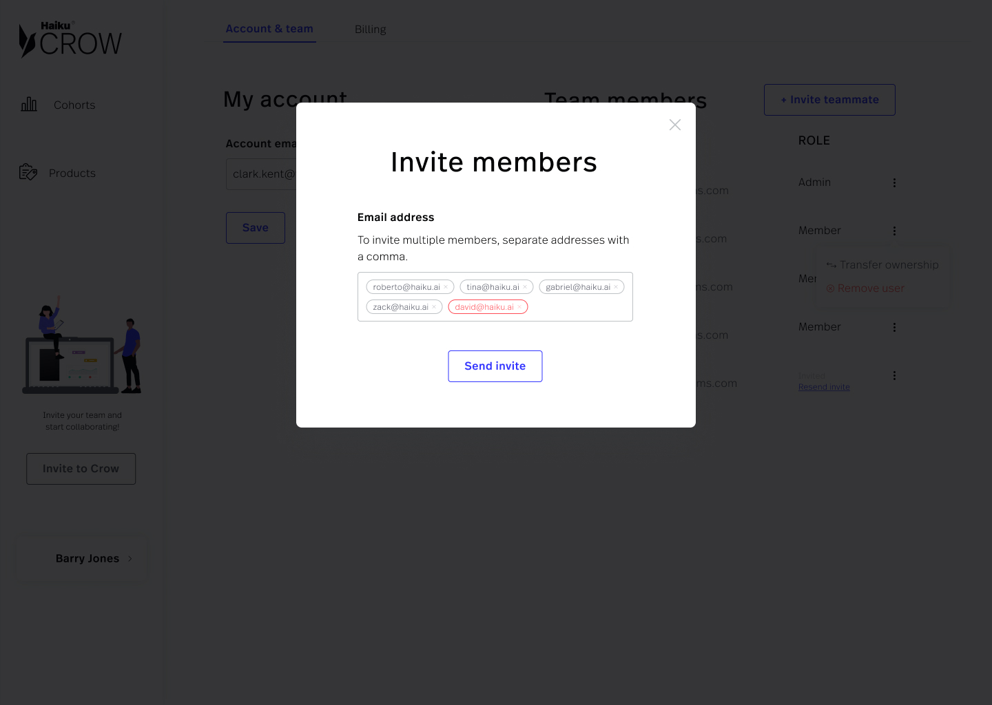
During this project, I also had the chance to help the development team out by personally shipping code to get the implementation to look as close to the design as possible.
The app was implemented using Vue. I modified some of the design tokens that were being extracted from my design files via Diez, I took a general pass at the app, adjusting colors, sizes, spacing, shadows, as well as implementing the desired interactions on components such as the team CRUD.
Outcomes
I left the Haiku team on the last day of August 2020. By then, we had completed the first two phases of the product idea validation process, and the third phase (concierge MVP build, plus willingness to pay validation) was well underway. After my departure, the team continued working on the product, adding new features, re-branding the product to Haiku Optimizer, and moving forward with the sales efforts.
We reached the goal of planning, researching, designing, and implementing a new product almost to completion in under 5 months, between 4 people.
Testimonial
"Tina is a highly effective UX designer, who helped drive initial design for two greenfield products and major design iterations of two existing products at Haiku. Tina is also a talented visual designer [...]. Beyond design skills, Tina is highly versatile. Working at a startup, Tina had no hesitations about wearing many hats. From marketing to business operations to shipping code, Tina jumped in everywhere that duty called, and did so with aplomb. [...] Finally, Tina is a gifted communicator with world-class organizational skills."
ZACK BROWN – FOUNDER & CEO – HAIKU SYSTEMS INC.